Sloop Brewing Co.
Graphic Design Lead July 2025 - Current
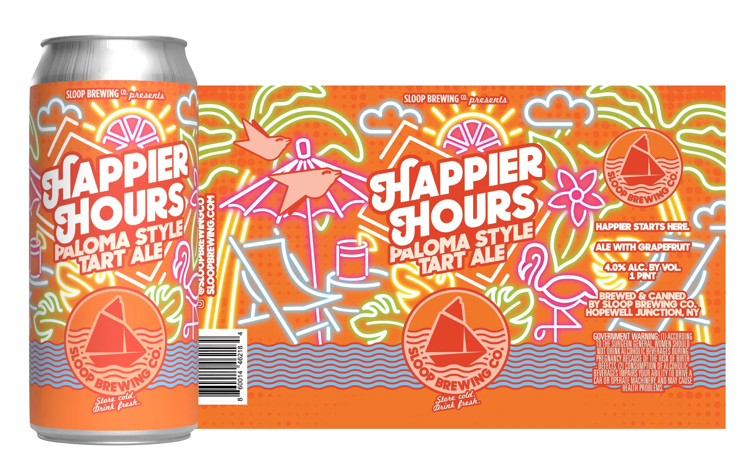
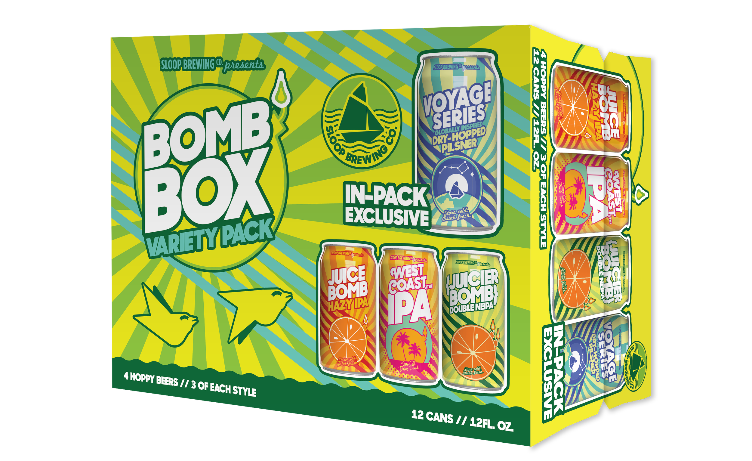
Sloop’s brand/logo refresh I created when Jack’s Abby acquired them in 2025, as well as several labels I created to fit in this new brand architecture.
Old Logo:
Outer ridge inspired by a bottle cap (no longer producing bottles)
Compass not recognizable
Main icon inspired by namesake “Sloop” boat style (hard to identify as a boat)
No water present (adds to the unrecognizable quality of the Sloop boat)
New Logo:
Simplified solid outer circle
Blue was replaced with a new shade that pops against white
Font consistent with that used in the rest of the Sloop brand’s assets
More recognizable Sloop boat shape (bottom no longer covered, and now sits in water to give context/shoutout the Hudson River)
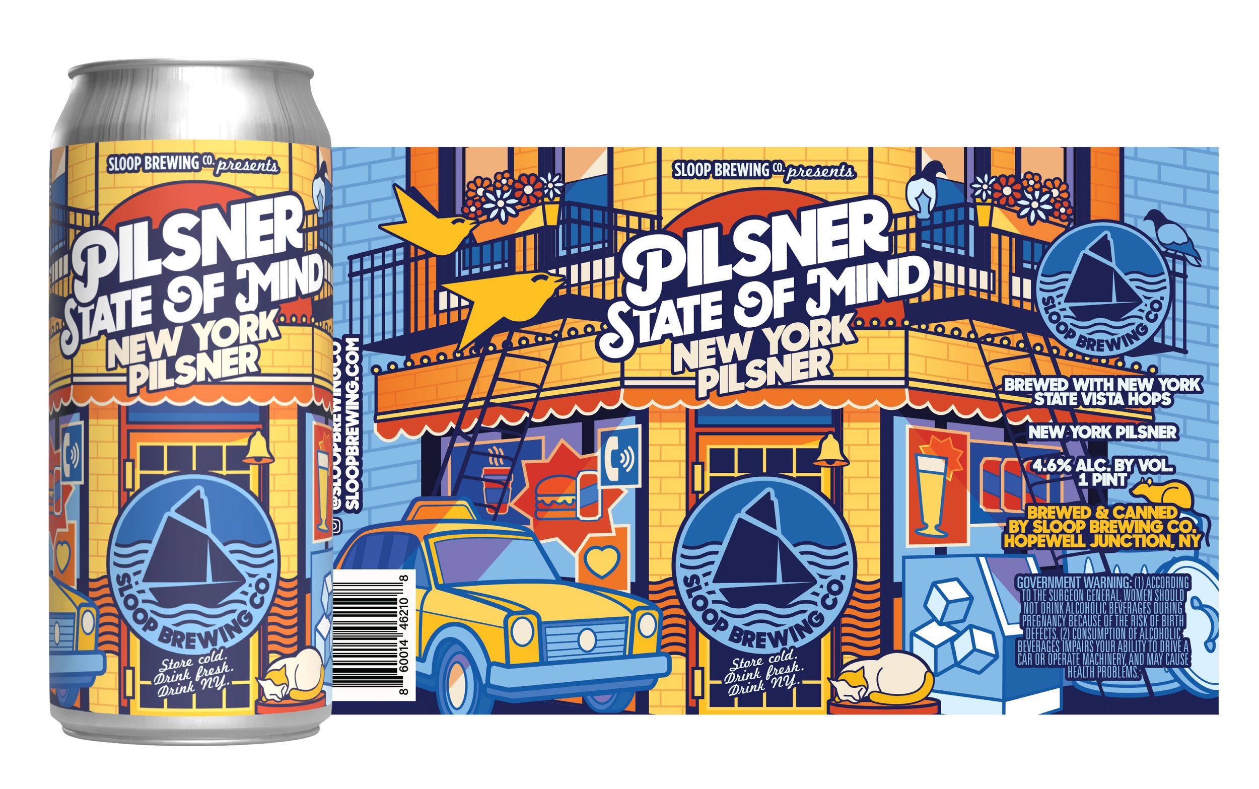
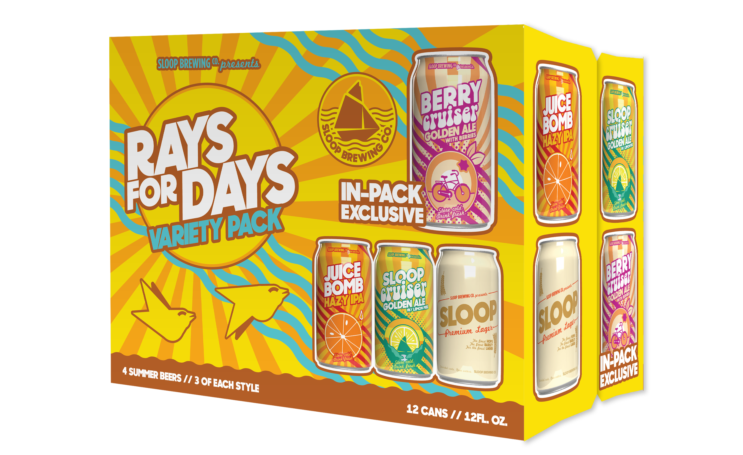
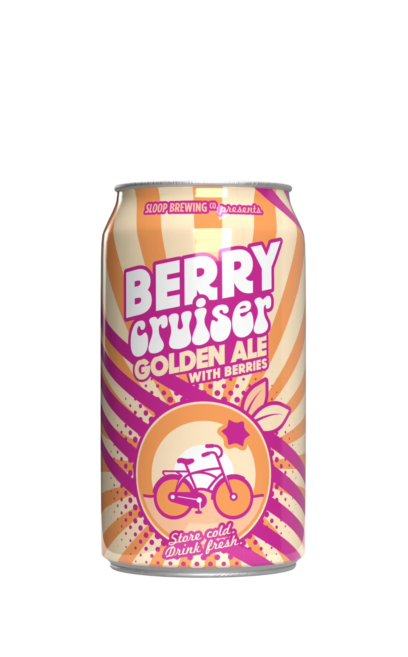
Artwork Refresh
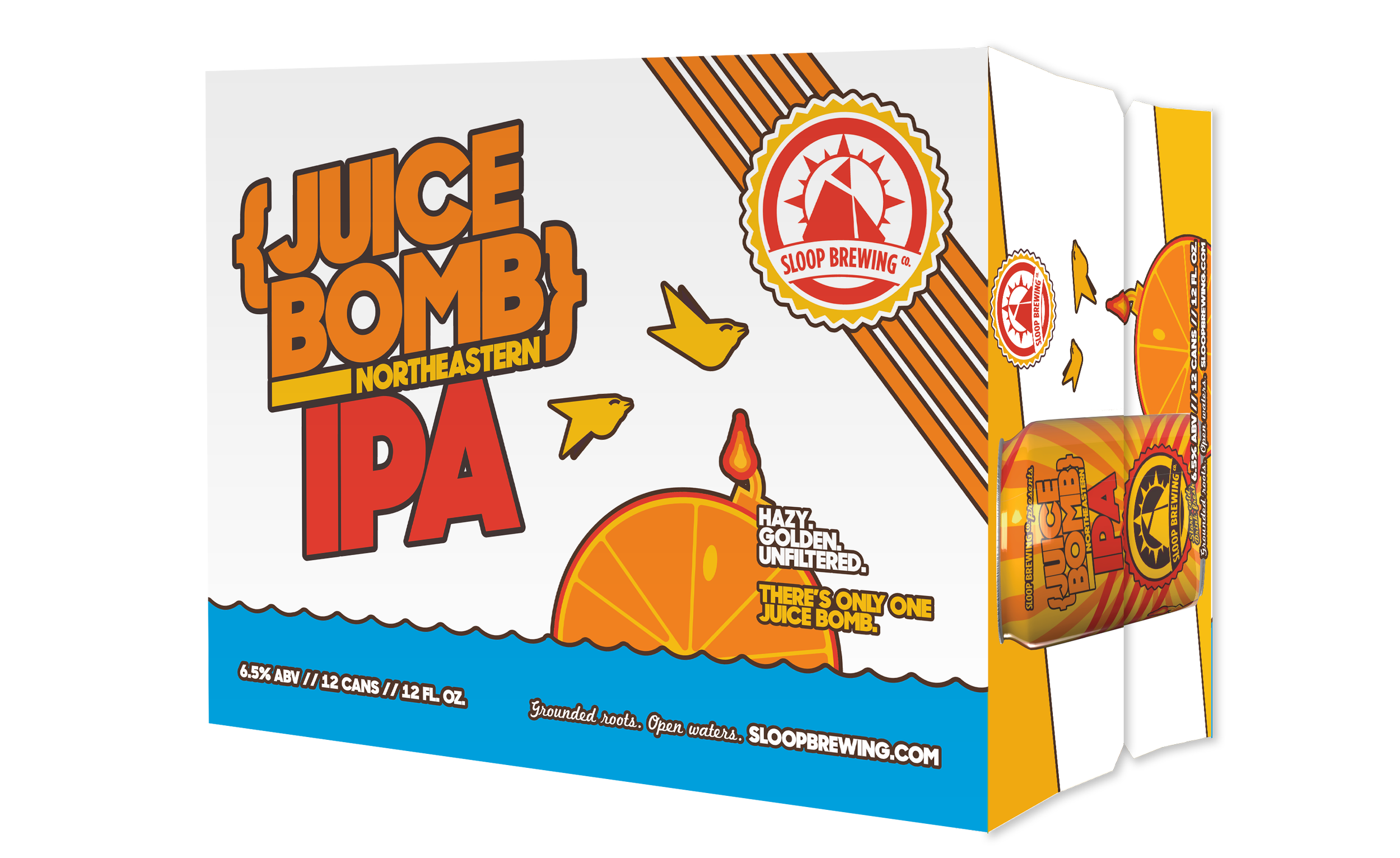
Refresh of Juice Bomb that emphasizes the juice “bomb” icon, making the beer's juicy orange flavor the star. The Juice Bomb name pops off the cans and cartons in a bright white, and the rich orange, yellow, and dark red color palette represents the liquid inside.
Previous Artwork
New Product Artwork
Logo Rework